
An Elevated Savings Experience
ROLE
UX DESIGNER | RESEARCHER
TIMELINE
80 HOURS
ESTIMATED READ
7 MINUTES

Problem
Users (ages 27-37) who primarily rely on mobile banking and have diverse savings habits, are lacking an easy and intuitive way to save within the 5/3 mobile banking app
Goal
Develop a feature that simulates potential savings growth over projected time frames and implements a process that enables users to create automatic drafts from accounts into their existing savings accounts based on these projections.
Business Opportunity
Customer Retention
Selling Opportunities – Will allow the bank to offer additional services like credit cards, investment products, and loans.
Stable, Low-Cost Funding
Savings accounts provide a relatively stable and low-cost source of funds compared to other forms of borrowing, such as issuing bonds.
Regulatory Benefits
Having a strong deposit base improves financial health and regulatory standing, making it more stable and attractive to investors.
Boosts Liquidity & Financial Stability
A large number of savings deposits will improve liquidity, ensuring it can meet withdrawal demands while still maintaining lending operations.
Source of Funds for Lending
Deposits in savings accounts will fund loans (e.g., mortgages, business loans, and personal loans).
User Insights


Initial Ideas
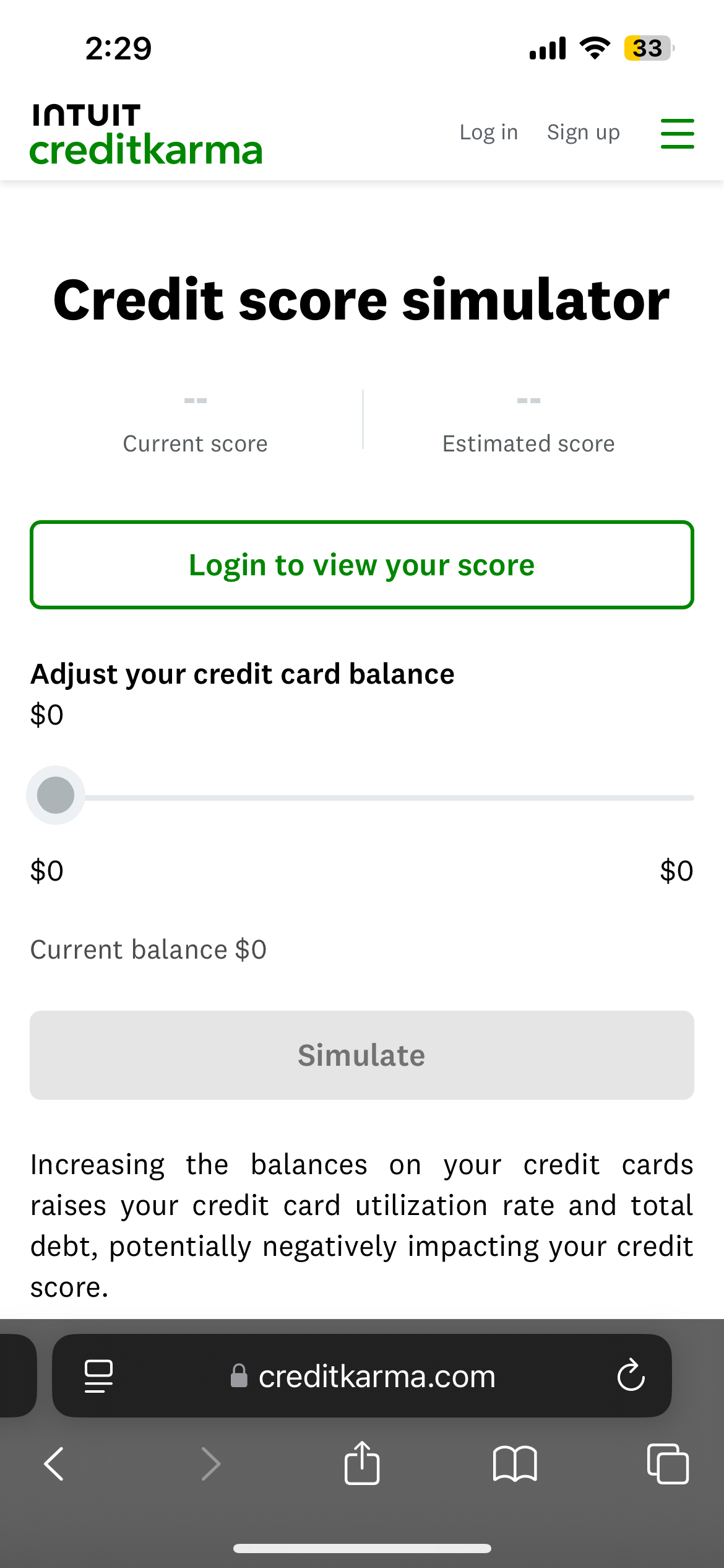
Reviewing other fintech apps like Credit Karma that have simulator options and merging it with fifth third banks current savings options helped me originite low fidelity screens
Initial Sketches

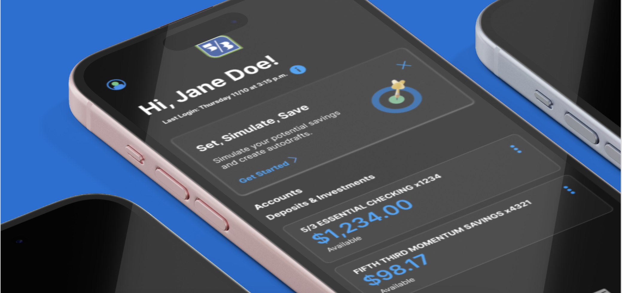
The initial screens featured low-fidelity wireframes of 53rd’s existing account pages, incorporating a savings simulator banner to enhance user guidance. This insert helped users navigate the simulation process, illustrating potential savings based on various input variables.

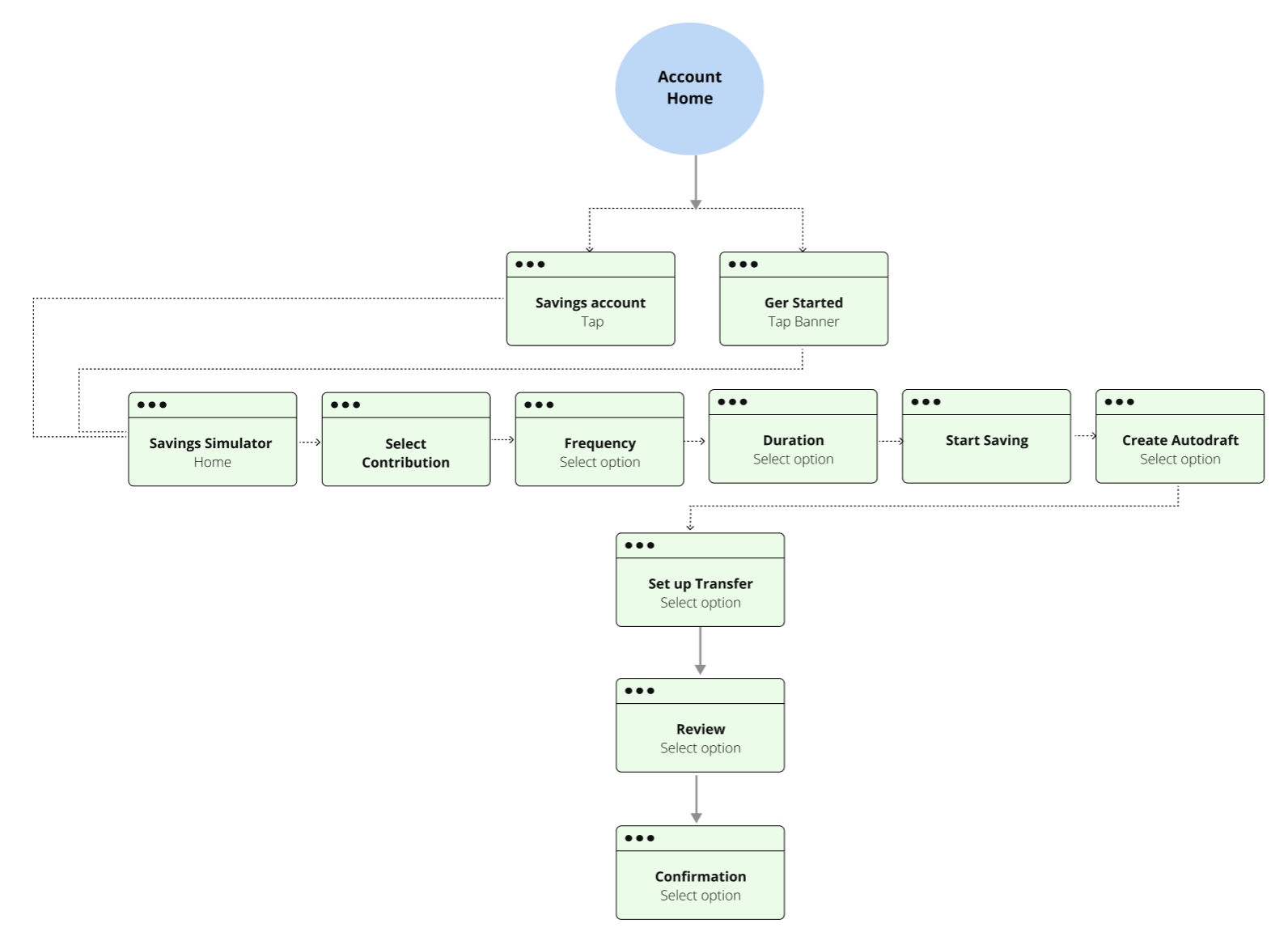
User Flow
User flow was the natural next step after initial sketches to see the progresssion of screens

Lo-Fi Screens
By combining the user flow and initial sketches together the low fidelity screens were created to show an elevated but still rough version of the simulator process.
After creating Lo-Fi screens, a prototype was created for user testing. The goal was to understand how easy it is to find and navigate the simulator and how to complete the process.

Users Feedback
“Dark Mode may be hard for some users, is there a light mode option to toggle?”
“Get Started/click me button is too small”
After User Feedback
Iterations

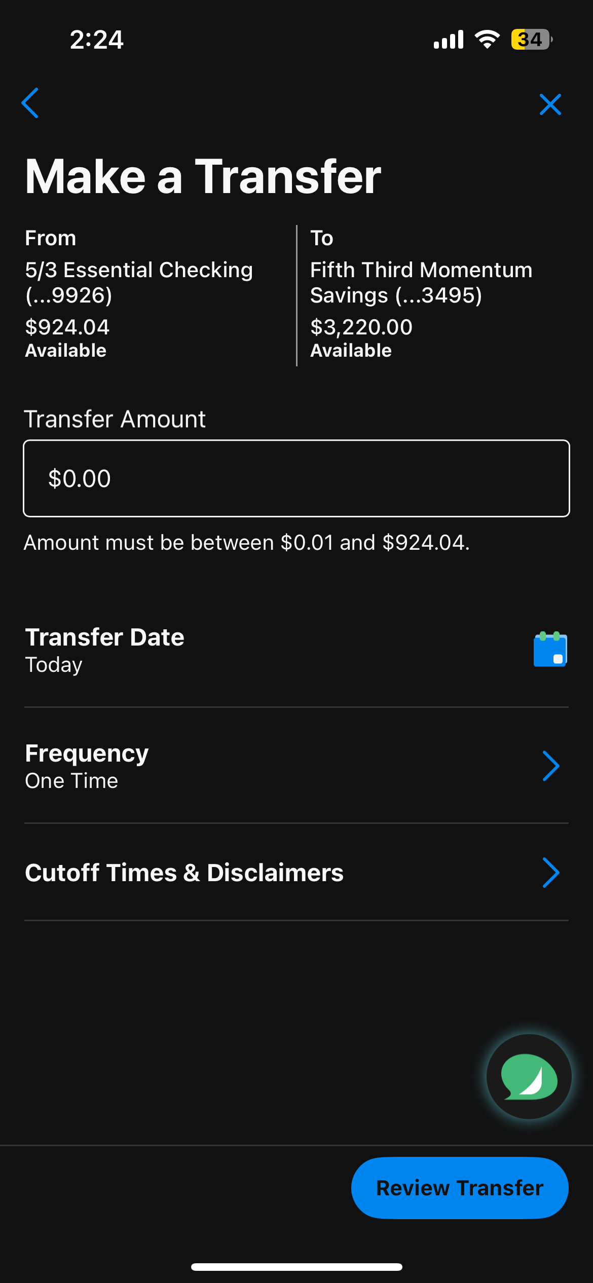
Final Screens
User testing


Design Impact
Users would like a section to name what they are saving for. I would love to explore this option more after more user research. In the end all users were able to successfully create an auto-draft, and 75% of users said this feature would help them save more.

View Similar Work

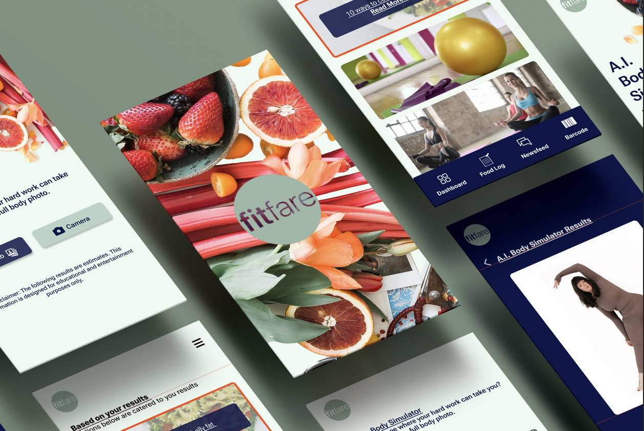
Fitfare: Rethinking Nutrition Tracking
Learn More