


PERSONALIZED MOTIVATION


ROLE
UX | UI DESIGNER | RESEARCHER |
GRAPHIC DESIGNER | BRAND DESIGNER
TIMELINE
100 HOURS
ESTIMATED READ
8 MINUTES

Getting Started
The Problem
People (ages 27-37) on their motivational journeys, who actively use apps for encouragement, are experiencing an incomplete and unbalanced motivational experience because
Existing apps are missing personalization
Users don’t see the value in motivation apps; especially those at cost
“Catered steps & things to try for a better life”-Fancy
“Apps that are intuitive are great. An all in one solution so that we don’t have to use so many”-J
“Daily reminder to continue to live in the present moment”-Vee
What motivation app users want
Based on User Interviews
Goal
Create a highly personalized motivational app that delivers inspiring messages and actionable steps tailored to each user’s goals.
“How Might We’s”
How might we make users feel more confident about their efforts when prioritizing self care?
How might we create a personalized experience?
User Research
Understanding our users
User Research Findings
Key Findings
All users are going through very specific issues; divorce, anxiety, depression, weight etc..
“Working out more to make myself more confident physically and mentally”
Most users who use motivational apps are either using multiple apps or are experiencing an incomplete experience from a single app
“Apps that are intuitive are great. An all in one solution so that we don’t have to use so many. Wellness and self-care have so many components. You won’t feel your best if your finances aren’t right, or your diet is off or you are doing the work mentally. Many things need to be balanced”
On approaching this problem, it was important to gain a better grasp of what users want from motivational apps and what current apps are lacking. I conducted five 1:1 interviews with individuals who are on their motivational journeys .
Our goals were to:
• Uncover pain points
• Discover the best ways to motivate users


Personas
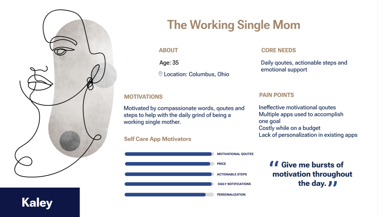
Empathizing with the Target Users
To gain a deep understanding of our target users, I developed personas based on initial user interviews. This process helped distill user needs into clear insights while allowing me to empathize with their goals, motivations, and priorities.
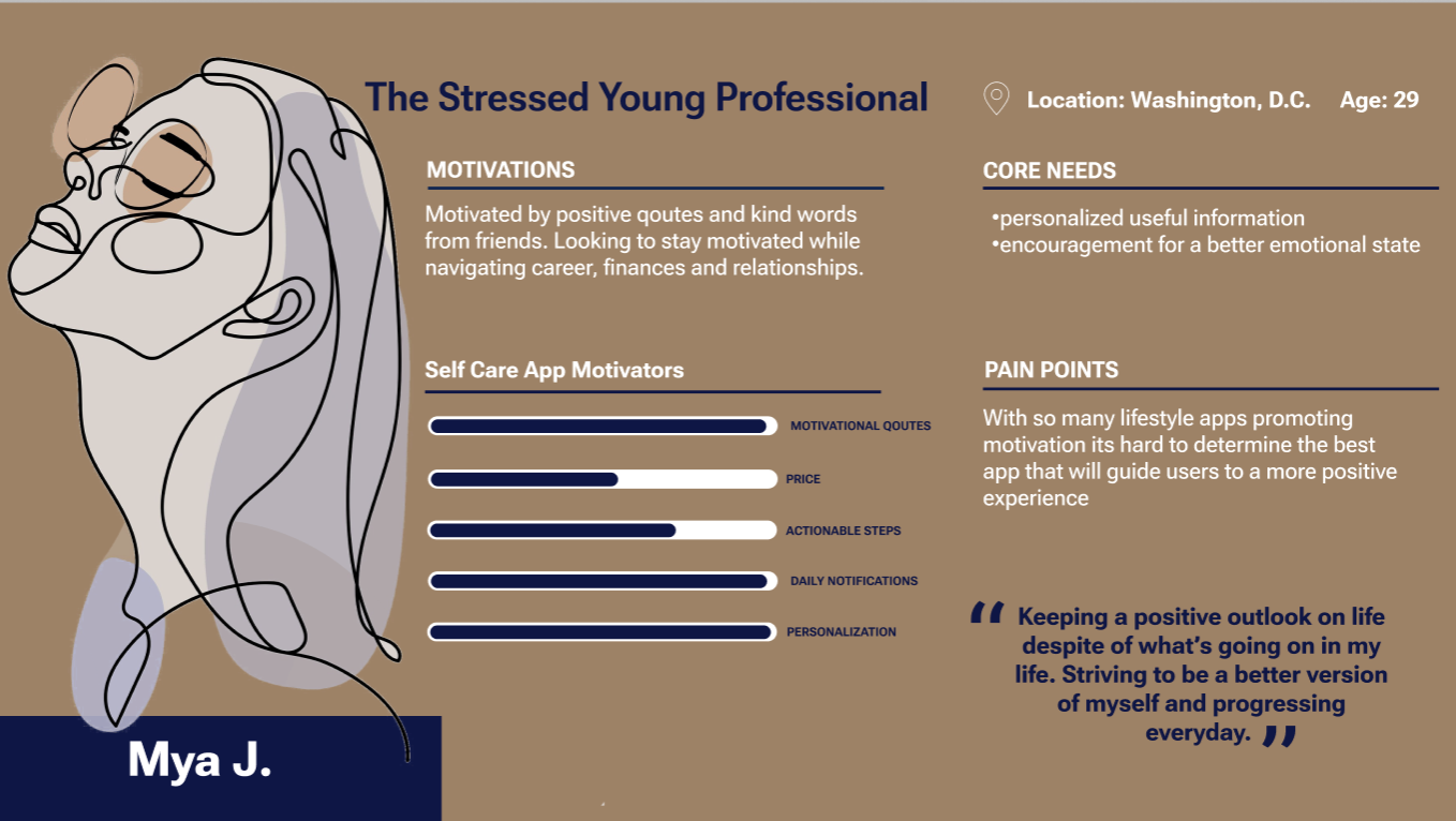

What thier users are saying
Competitor Benchmarking

Daylio
“It delivers on daily quotes but they're all really lame and unmeaningful.
They all just feel kinda shallow. You'd get the same level of meaningfulness from a motivational cat poster. But since there's no cat it's way lamer.”
I am

“Good affirmations but they make you pay if you want to be sent daily affirmation notifications. screw that.”
MOTIVATION

“Can basically do nothing, like yeah it works and it does give you affirmations. But i downloaded this app to help me with specific stuff”
Missing personalization and premium features are costly
Not customizable & some users complain the motivational qoutes are insensitive and repetitive
Exploring other apps
What other apps are doing?

Daylio offers daily emotion input
“I am” offers customization during onboarding but the categories are limited and general
Motivation offers catergorized qoutes in app settings
While apps like I Am, Motivation and Daylio offer some level of personalization, the options are often broad and generic.
Motivation offers well thought out qoutes

“I am” offers affirmations that include the words
“I am”
Most existing motivation apps prioritize delivering qoutes and affirmations rather than tailoring the overall motivational experience to individual users.
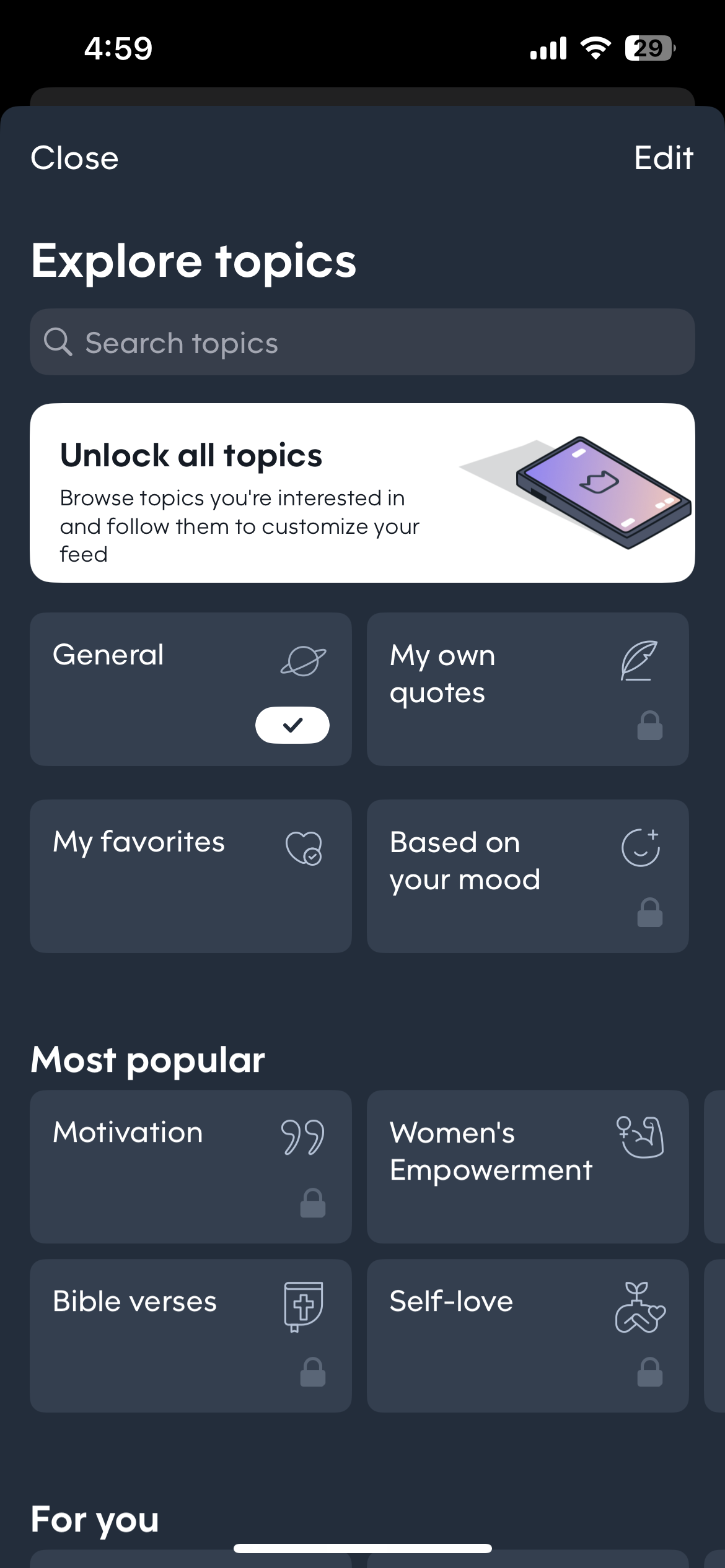
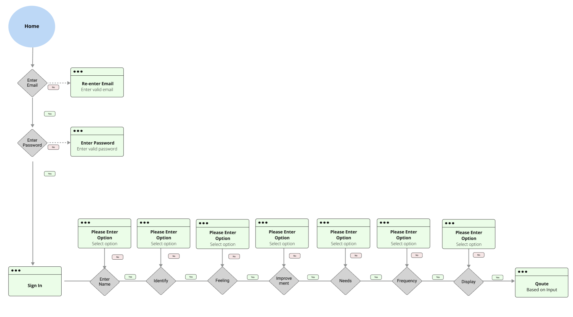
User Flow Diagram
Information Architecture
Learning about how other apps delivered qoutes and thier personalization process helped me create the user flow below. Taking the personalization a step further to get to know our users.

Once the information architecture was set, I focused on defining the brand identity before wireframing. This foundation helped guide the design and ensured consistency for the mid-fidelity screens.
Our Vibe
Brand Identity
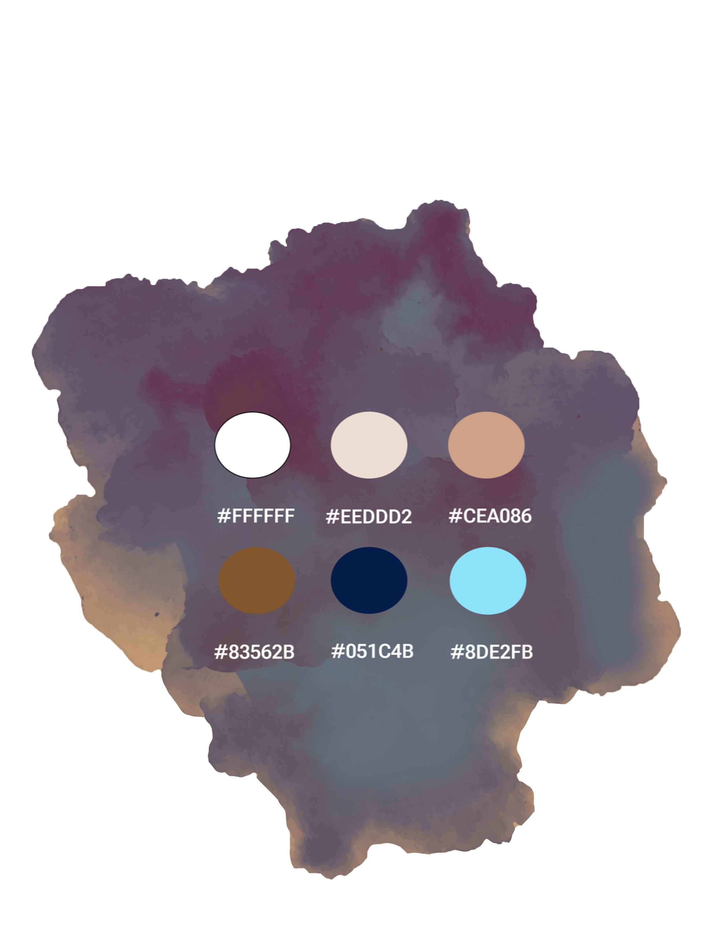

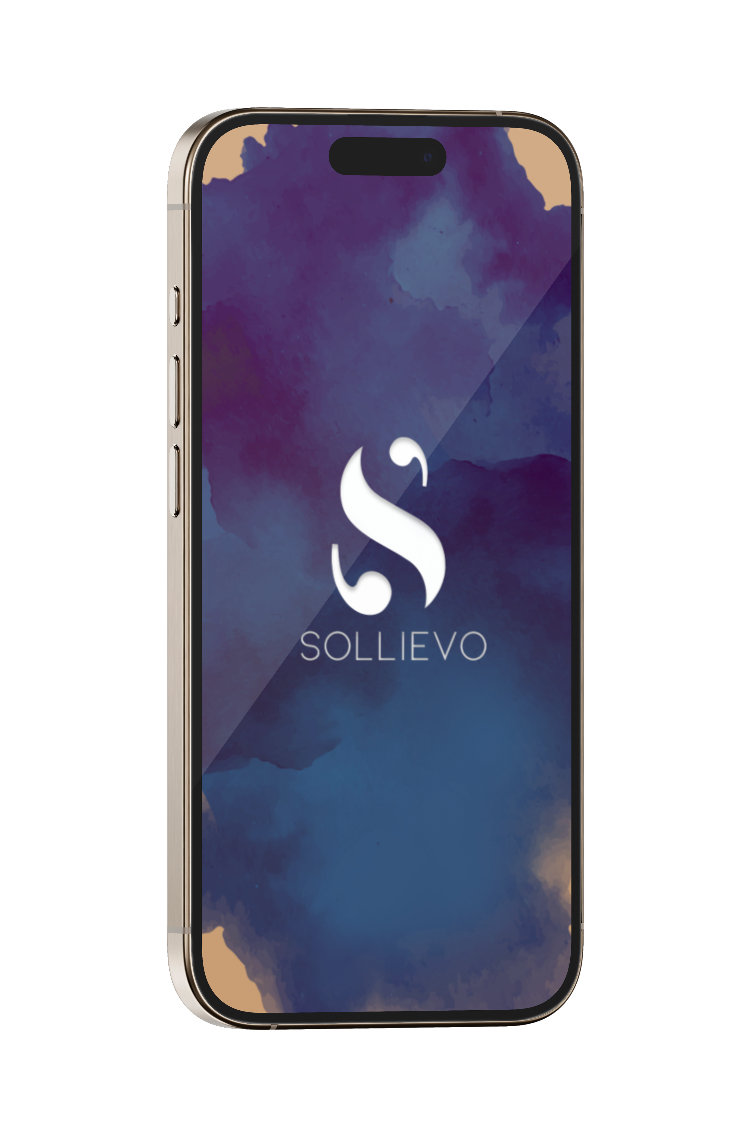
Sollievo: Italian noun- Ease
Ease coincides with the primary function of this app
Color-Users associate self care and ease with neutral tones and blues

Logo Incorporates the app's main function of providing quotes which includes an abstract letter 'S' shape with a fusion of quotation symbols.
Another Step Closer
Initial Screens
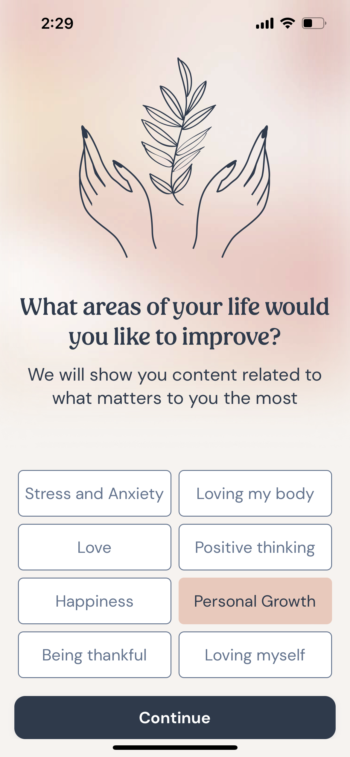
After brainstorming and research, I knew personalization during the onboarding process was key.
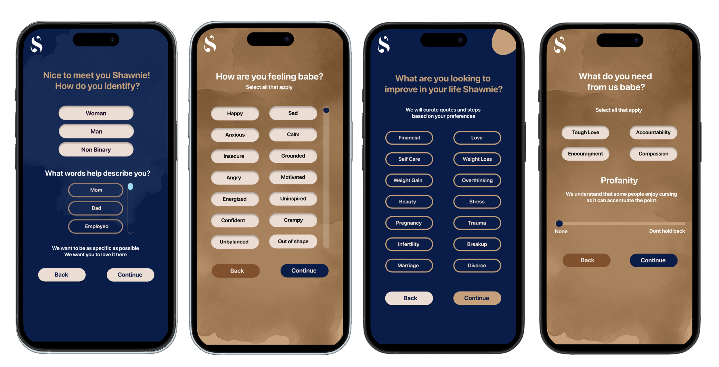
I designed a personalized motivation app that promotes self-care by delivering tailored quotes, reminders, and actionable steps. The app features an intuitive onboarding process, allowing users to set their preferences upfront, ensuring they receive relevant and meaningful motivation. Personalization includes name, pronouns, feelings, areas of improvement, needs, frequency, and display preferences.


Intro Screens
Mid-Fidelity Mockups
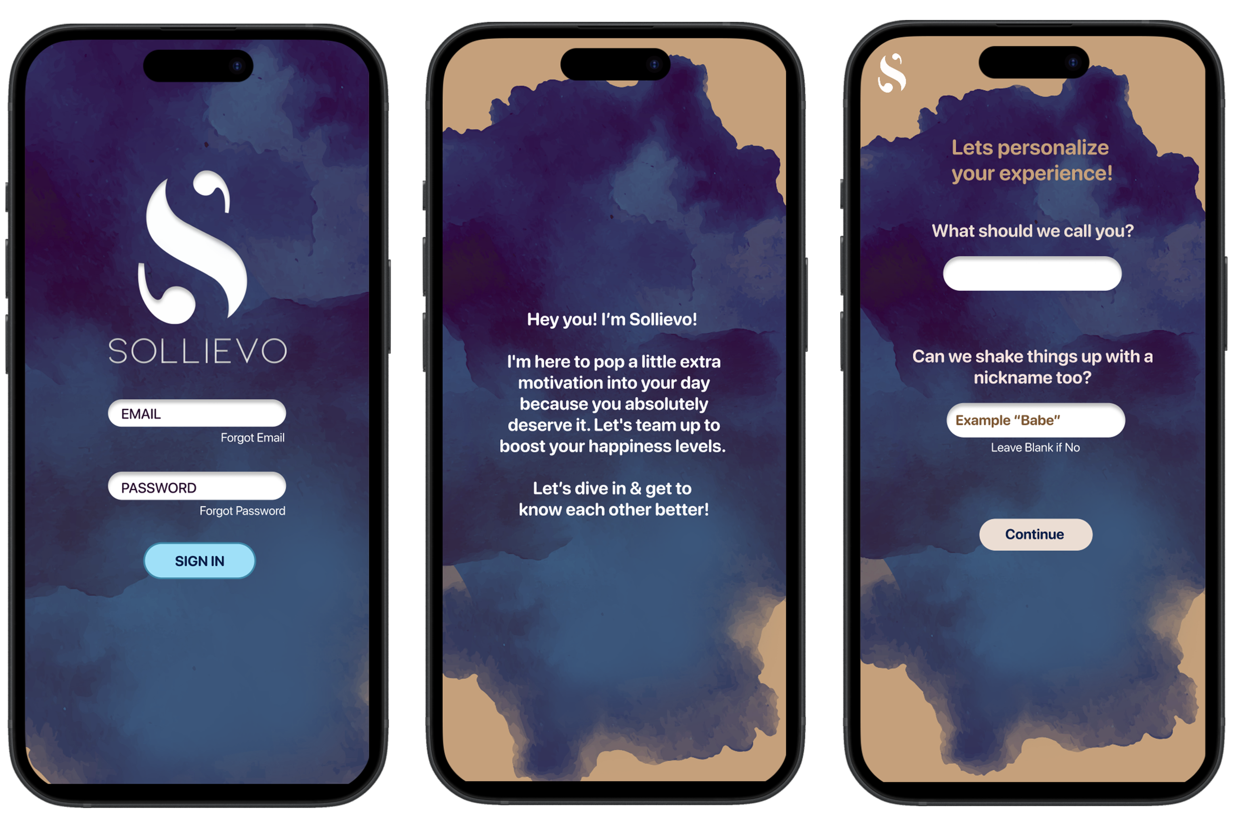
Login
What the app does
Name
Identify

Feelings
Improvements
Needs
Frequency
Display
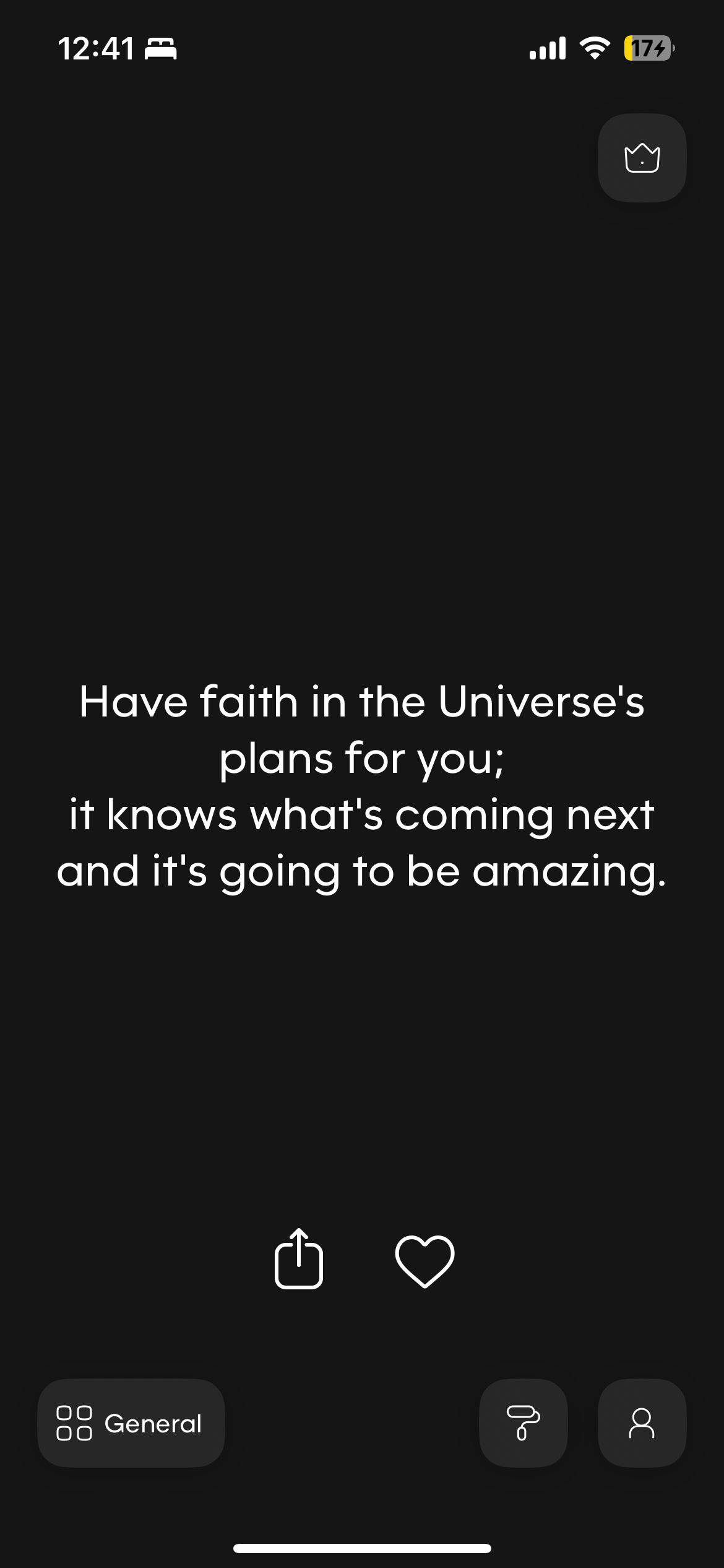
Personalized qoute
Visual Design
Feedback & Iterations
Through user testing I continued to iterate on the designs, shifting to high fidelity.
Before
After

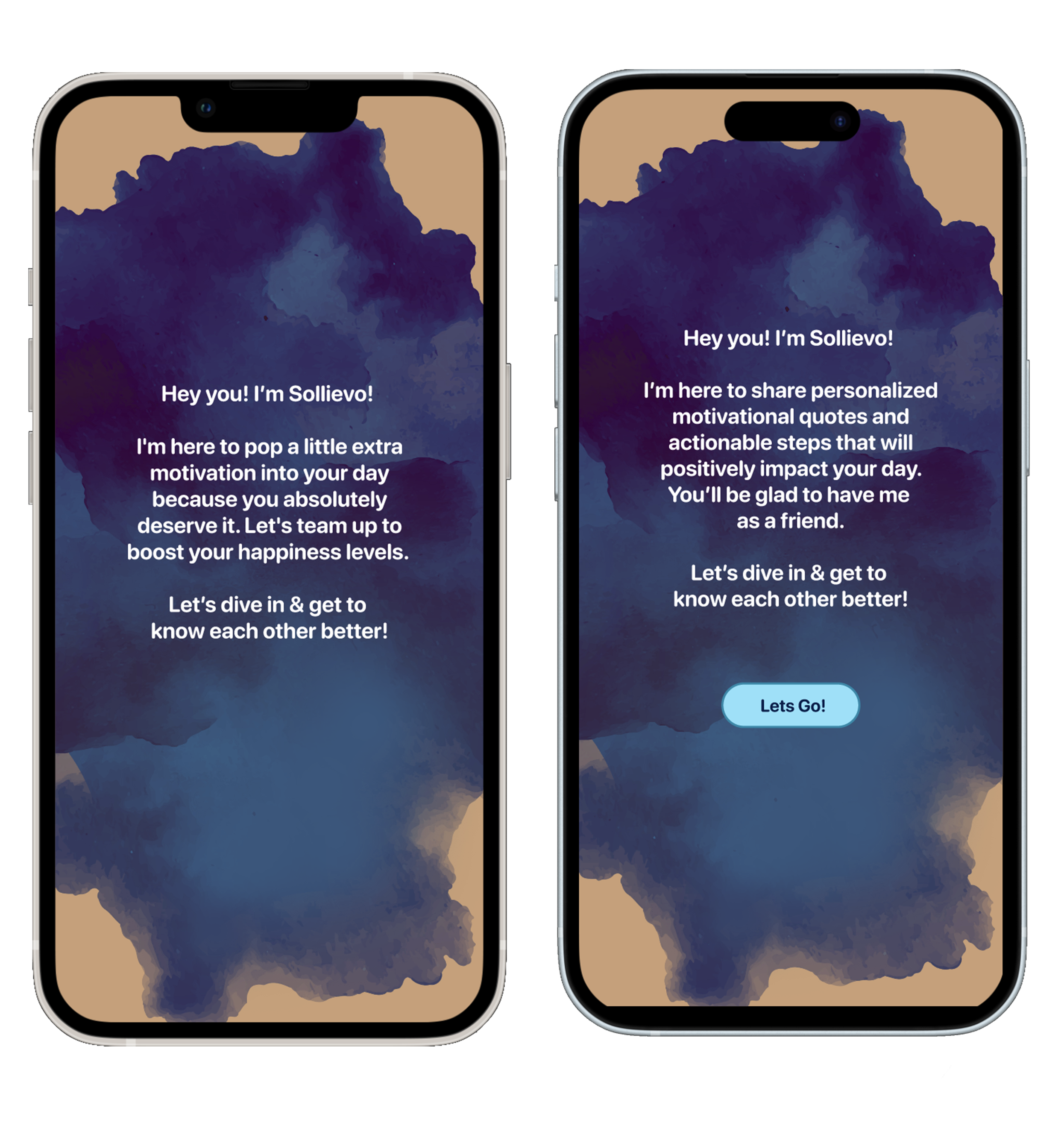
Intro Screen iteration
Lo-fi screens didnt have an intro screen but once I got started I realized it was necessary
Added a brief intro page to help users prepare for onboarding
Changed the verbiage on the intro page based on user feedback
“The name ‘Sollievo’ is fitting. However, I recommend in the introduction page to immediately convey what ‘Sollievo’ is and how it can positively impact the user’s life to hook the user right away.” -Shawn
Added a Let’s go button
“On intro page please add “let’s get started” button no indication to move forward” -Ken
“How are you feeling ” iterations
Initially I wanted to incorporate emojis but realized that it didn’t go with the aesthetic of Sollievo’s calm relaxed brand identity.
Changed the scroll option for easier navigation
Mid-Fi
Lo-Fi
Hi-Fi
'“Qoute ” Iterations
Increased Menu icon
Changed menu & logo color for visibility
Flipped image
Added qoutation marks
“Maybe add quotation marks on last page”-Ken
Changed placement of icons & size

Lo-Fi
Mid-Fi
Hi-Fi
The Onboarding Process
When users open the app for the first time, they’re able to select their personalized motivational preferences

Feedback
”Aesthetically appealing interface that is stunning”
“What do you need from us babe” made me feel more connected to the app ”
“Easy to understand, quick, lots of options, feels like a friend”
“Enjoyed the profanity option never seen that option before”
Design Impact
User testing revealed several opportunities for future feature development
The ability for users to input physical characteristics, allowing for more personalized imagery
Incorporating specialty groups, including but not limited to 'Black Girl Magic', LGBTQIA2S+ and 'Men’s Mental Health', to better serve specific and diverse communities
Lastly, I propose adding an option for data input beyond the current button-based interface, offering users greater flexibility
View similar work
Fitfare: Rethinking Nutrition Tracking
Fifth Third Bank: Elevated Savings