
Rethinking Nutrition Tracking
ROLE
UX | UI DESIGNER | RESEARCHER |
GRAPHIC DESIGNER | BRAND DESIGNER
TIMELINE
100 HOURS
ESTIMATED READ
10 MINUTES

Problem
Users (ages 25-35) hesitate to use nutrition tracking apps due to uncertainty about its value.
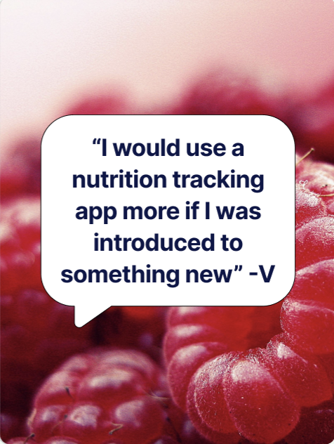
How user’s feel about nutrition tracking?
Based on user interviews

Goals
Show the value of nutrition tracking in an interesting way
How Might We’s
How might we make users feel confident about their efforts when tracking nutrition?
How might we stay relevant with competitors?

Once the goal and how might we’s were created, user interviews were conducted to help me understand what users want in nutrition tracking
Understand our users
Key Findings
I conducted five 1:1 interviews with individuals who are on their fitness journeys . Our goals were to:
• Uncover pain points
• Discover the best ways to interest skeptical users in nutrition tracking apps
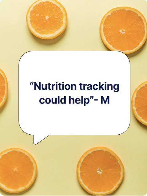
All users want to see the benefit of nutrition tracking
“I must see the benefit of paying for premium”
“I want to see what the features do”
Most users want something easy to navigate thats also informative
“Something easy to navigate and simple”
“Introduce ways to approach different lifestyles”
Personas
Empathizing with Target Users
Once pain points were uncovered creating user interviews helped me compose different user personas with varying levels of nutrition experiences

Victoria- The Pescatarian Trainer
A fitness professional with a strong educational background in nutrition and its effects on the body. This user is experienced with nutrition tracking apps and seeks to explore new features or insights that could enhance their existing knowledge and routine.
Brian- The Pizza Loving Novice
An individual accustomed to an unhealthy diet but motivated to improve their eating habits due to health concerns. They have had previous negative experiences with nutrition tracking apps, finding them expensive and not particularly helpful in their wellness journey. They seek a solution that is affordable, effective, & user-friendly.
Kenneth- The Non-Tech-Savvy Lamb Lover
A user who is moderately health-conscious but struggles with consistency in maintaining healthy habits. While not entirely unfamiliar with technology, they find nutrition tracking apps cumbersome and would prefer a more intuitive, less intrusive solution that simplifies the process of monitoring their diet.


During user interviews I learned about existing nutrition apps that users tried to help expand upon current pain points

What thier users are saying
Competitor Benchmarking
“You'll need a fitness degree to be able to use the app. Clearly they assume everyone has grown up with technology. It's a shame because it seems like it could really help people”
“The app is still not user-friendly.”
“Nothing about Cronometer is easy and I am very frustrated.”

“ Some days you just want to eat and not worry about fat content, etc. but still want to keep track of what you've done. It's creating food anxiety and major guilt. I'm sad I paid so much for the year. Now I feel obligated to use it.”
“Not very intuitive”
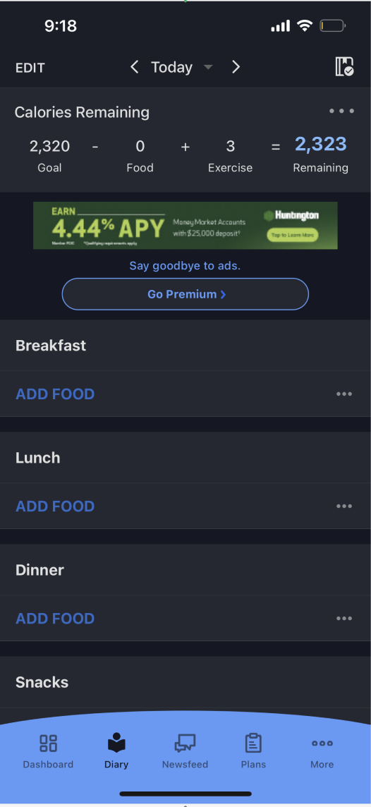
Current competitor apps are hard to use and pricey
Exploring other apps
What other apps are doing


Cronometer’s recipe analysis and sharing is a key custom feature

Myfitpal focuses on the community aspect with their newsfeed feature that offers related articles, workout plans and food recommendations.
After viewing what other apps are doing and speaking to potential users, I knew I needed to focus on a feature that interesting, easy and specific to this brand. User flows, initial sketches and feature development were my next step.
User Flow
User flow guides user through the simulator process. I wanted to focus on a feature that had minimal steps to help simplify the process

Once flows were done the brand identity was created to help develop future low fidelity screens
Our Vibe
Brand Identity
Name
Fit: adj; in good health, especially because of regular physical exercise.
Fare: noun; a range of food of a particular type
Logo
The logo’s thick-to-thin type symbolizes the app’s transformative impact on weight loss

Color
Based on users associated fitness nutrition with colors found in nature.

Initial Sketches
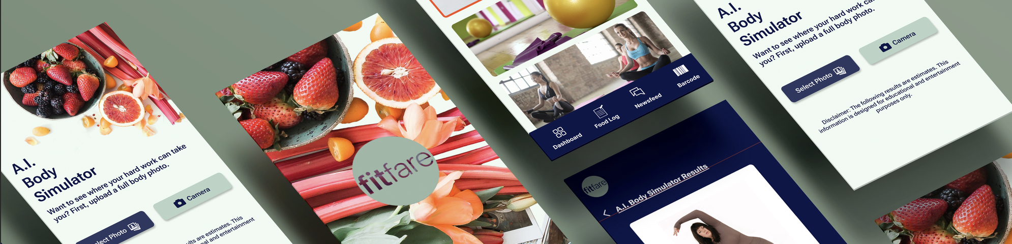
After research I realized that we needed an easy feature that would interest users. While exploring competitor apps, I realized each app had a special feature that users enjoyed. Thus the A.I body simulator was born from users wanting to see immediate benefits from eating healthy, easy navigation and something that would set us apart from existing apps was also key
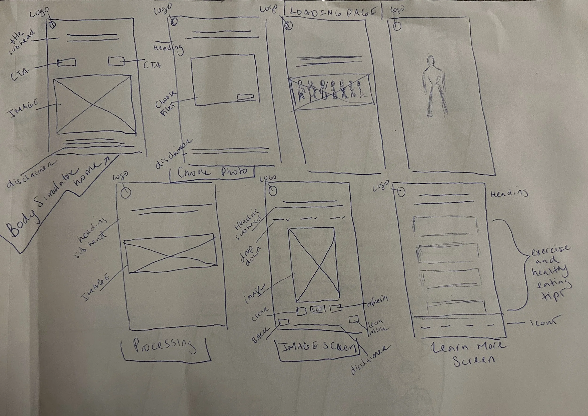
Lo-fi Screens
After initial sketches the key low fidelity screens for the body simulator feature was created. These screens show the photo selection, simulator results, and catered steps based on your results.

Upload Screen
More Info Screen
Body Results Screen

Upload Screen
Body Results Screen
More Info Screen
Mid-fi Screens
After initial sketches the key low fidelity screens for the body simulator feature was created. These screens show the photo selection, simulator results, and catered steps based on your results.
After developing the Mid-Fi screens, I wasn’t happy with the visual aspect and button drop option on the body screens. It also didnt feel as easy as I initially wanted so I explored other input options.
High Fidelity Screens
My second iteration included using a scrolling circular graphs opposed to drop down menus. The drop down menu options seemed to complicate the process and the goal was to simplify it.
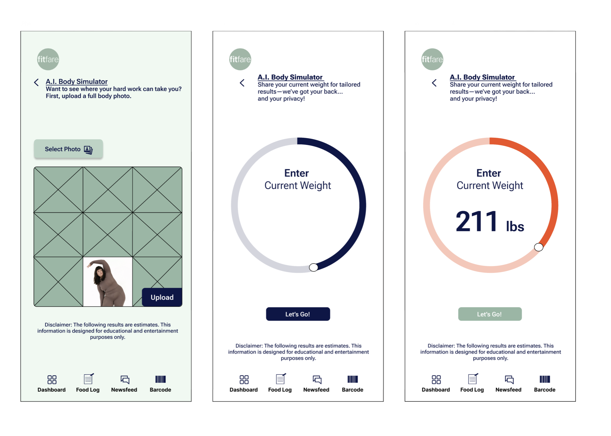
Upload
Enter Weight
Weight Screen

Overview
Selections
Results
I added additional screens to make the steps easier to understand. The scroll bar option is a more convenient and interactive choice.

I am currently working on a reiteration to further simplify the process. Check back soon for the final prototype